In our previous post, we covered how to use Storybook and WP-CLI to add additional blocks to your project. This post will walk you through modifying an existing block step-by-step.
Since Eightshift Development kit is a starter theme, made for developers to jumpstart and speed up their development, you're welcome to modify files in it directly. There is no need to create a child theme to protect changes from updates.
Modifying a block or a component?
Because we used the Quote block in our previous post, we will continue using it as an example as it's a fairly simple one. One of the first questions you may ask yourself could be: "Should I modify a component or a block?". And the answer is - it depends.
If you compare components/quote/quote.php (component) and custom/quote/quote.php (block), you'll notice that most of the HTML code is inside the component, while the block pretty much only renders the Quote component inside a wrapper. This example will walk you through the whole process of adding a new attribute and its options to a block.
What will we do?
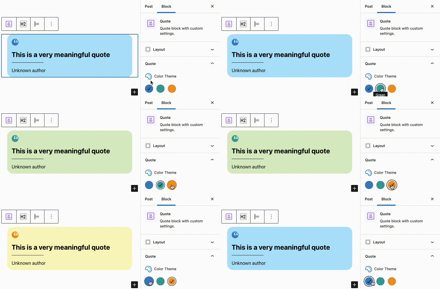
We want to style the block and add a new feature. An option to choose a color theme for the Quote block. These are the specs:
- each Quote block has a background with rounded corners
- option for three color themes: blue, green, yellow
- the background has a lighter shade of the selected color
- quote icon has a stronger shade of the selected color
To better help you visualize, this is how the Quote block should look like after making these changes, showcasing all three color theme variations:

Adding background
Initial background styling is fairly straightforward. Navigate to src/Blocks/components/quote/quote-style.scss and paste the following code inside .quote class:
padding: calc(var(--base-font-size) * 1.6rem);
border-radius: calc(var(--base-font-size) * 2rem);
background-color: global-settings(colors, light);
You may notice we're using calc instead of directly writing values in rems. This way makes it much easier to calculate pixel size since calc(var(--base-font-size) * 1.6rem) equals 16px.
For now, we will add a simple light grey background to see how it looks. We'll replace this value later with a CSS variable.
Tip: don't hardcode hex color values directly inside your component. Instead, use colors defined in your global manifest.
You'll notice that the changes are visible both in the editor and on the frontend. Since the Gutenberg editor adds some additional markup, sometimes you'll need to add additional styling only for the editor. In case we need to override something in the editor for our Quote component, we would simply create quote-editor.scss.
Adding new colors to your project
Because the theme currently doesn't have all the required colors, we need to add additional colors which will be used for the color theme feature. We will use the colors already defined in the manifest for icon color, but we need to add lighter variations of those colors to use them for the background. Navigate to your global manifest, which is located inside src/Blocks/manifest.json and add the following values inside colors:
{
    "name": "Light Blue",
    "slug": "light-blue",
    "color": "#B3E5FC"
},
{
    "name": "Light Green",
    "slug": "light-green",
    "color": "#DCEDC8"
},
{
    "name": "Light Yellow",
    "slug": "light-yellow",
    "color": "#FFF9C4"
}
Adding a new attribute and options to manifest
For editors to be able to choose which color theme to use for the Quote block, we need to define an attribute for it in the manifest. Navigate to src/Blocks/components/quote/manifest.json and add the following value inside attributes:
"quoteColorTheme": {
    "type": "string",
    "default": "blue"
}
Double-check the path of the manifest used in this example. We're adding it inside the Quote component manifest, not the Quote block manifest.
After that, since we want to have a fixed number of options, we need to define available options. We can do that inside options which is on the same level as attributes:
"options": {
    "quoteColorTheme": [
        "blue",
        "green",
        "yellow"
    ]
}
CSS variables
Our next step is to add CSS variables to the Quote component's manifest. Inside manifest.json, on the same level as attributes, add the following code:
"variables": {
    "quoteColorTheme": {
        "blue": [
            {
                "variable": {
                    "quote-background-color": "var(--global-colors-light-blue)",
                    "quote-icon-color": "var(--global-colors-blue)"
                }
            }
        ],
        "green": [
            {
                "variable": {
                    "quote-background-color": "var(--global-colors-light-green)",
                    "quote-icon-color": "var(--global-colors-green)"
                }
            }
        ],
        "yellow": [
            {
                "variable": {
                    "quote-background-color": "var(--global-colors-light-yellow)",
                    "quote-icon-color": "var(--global-colors-yellow)"
                }
            }
        ]
    }
}
Now, navigate back to Quote component's quote-style.scss and replace the background-color which we used for testing with the following:
background-color: var(--quote-background-color);
As you can see, the variable name is the same one we used when defining background color variations in the manifest. For icon color, we do the same. After adding a new color to &__icon selector, our code should now look like this:
&__icon {
    display: block;
    margin-bottom: 1rem;
    color: var(--quote-icon-color);
}
Outputting CSS variables in editor
To make our color theme visible in editor, we have to add few lines of code to src/Blocks/components/quote/components/quote-editor.js file. First, we need to import a few functions. We need useMemo from react, outputCssVariables and getUnique from @eightshift/frontend-libs/scripts and finally, we need data from the global manifest.
After importing these and defining a unique constant, your code should look like this:
import React, { useMemo } from 'react';
import classnames from 'classnames';
import { checkAttr, props, selector, outputCssVariables, getUnique } from '@eightshift/frontend-libs/scripts';
import { HeadingEditor } from '../../heading/components/heading-editor';
import { ParagraphEditor } from '../../paragraph/components/paragraph-editor';
import manifest from './../manifest.json';
import globalManifest from './../../../manifest.json';

export const QuoteEditor = (attributes) => {
    const unique = useMemo(() => getUnique(), []);
    //...
Next, we need to add a unique data-id and output the <style> tag containing CSS variables.
Modify your return statement so it looks like this:
return (
    <>
        <figure className={quoteClass} data-id={unique}>
            {outputCssVariables(attributes, manifest, unique, globalManifest)}
            //...
If you try adding a Quote block in the editor, you should notice that it now has a light blue background with a quote icon in a darker shade of blue. This is the default value for the quoteColorTheme attribute we added in the component's manifest.
Outputting CSS variables in the PHP template
The PHP template for the Quote component is located in src/Blocks/components/quote/quote.php. This process is similar to the one described above, it's just written in PHP. All helper methods we need for this are contained inside the Components class, which is already included in this file.
Similar to the JS template, we need a unique value, assign it to data-id, and output CSS variables. After adding these, the code should look like this:
<?php
//...
$quoteClass = Components::classnames([
    Components::selector($componentClass, $componentClass),
    Components::selector($blockClass, $blockClass, $selectorClass),
    Components::selector($additionalClass, $additionalClass),
]);

$unique = Components::getUnique();
?>

<figure class="<?php echo \esc_attr($quoteClass); ?>" data-id="<?php echo \esc_attr($unique); ?>">
    <?php echo Components::outputCssVariables($attributes, $manifest, $unique, $globalManifest); ?>
    //...
Both PHP and JS have the same helpers to make writing code for editor and front view as similar as possible.
Adding options
After adding these snippets, you should already see that your block is using the blue color theme, which we defined as the default value for quoteColorTheme in the manifest. We want to have an easy way to change the color theme in the editor. Now we'll add a new option which will do just that.
We will add these options in src/Blocks/components/quote/components/quote-options.js. Again, we will start with the imports we will need. First one is __ from @wordpress/i18n package. Additional imports we need are from @eightshift/frontend-libs/scripts, so we will just add those to the list.
import { __ } from '@wordpress/i18n';
import {
    //...
    ColorPaletteCustom,
    IconLabel,
    icons,
    getOption
} from '@eightshift/frontend-libs/scripts';
Next, we can add a new attribute in options called showQuoteColorTheme and set it to true by default. If we want to use this component in other blocks, we can use this attribute for showing or hiding Color Theme Options on a specific block that uses the Quote component.
Additionally, we need to get values for quoteUse and quoteColorTheme attributes. We can use the checkAttr helper which first checks if a block has saved attribute value. If not, it defaults to a value defined in the manifest.
export const QuoteOptions = (attributes) => {
    //...
    const {
        setAttributes,
        //...
        showQuoteColorTheme = true,
    } = attributes;
    //...
    const quoteUse = checkAttr('quoteUse', attributes, manifest);
    const quoteColorTheme = checkAttr('quoteColorTheme', attributes, manifest);
Finally, we add the Color Palette, which we will use for switching color themes.
return (
    <>
        //...

        {quoteUse &&
            <>
                {showQuoteColorTheme &&
                    <ColorPaletteCustom
                        label={<IconLabel icon={icons.color} label={__('Color Theme', 'es-theme')} />}
                        colors={getOption('quoteColorTheme', attributes, manifest, true)}
                        value={quoteColorTheme}
                        onChange={(value) => setAttributes({ [getAttrKey('quoteColorTheme', attributes, manifest)]: value })}
                    />
                }
            //...
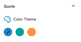
The Color Theme option should now be visible and fully functional inside the Quote block.

Adding transitions in the editor
The options work, but you may notice there is no transition in the editor. It is not necessary but will improve the user experience. Since we do not need transition effects on the frontend, we can add these CSS rules only to the editor. To do that, we start by creating quote-editor.scss file inside src/Blocks/components/quote folder.
We add the following CSS:
.quote {
    transition: background-color 0.3s ease-in-out;

    &__icon {
        transition: color 0.3s ease-in-out;
    }
}
Because we've added a new file, we have to run npm start again. Now the transition between colors will be much smoother.

Closing thoughts
In this post, we've covered the whole process of adding a new attribute. It involves a lot of steps and things to keep in mind, but once you get used to it, you'll be able to add quite powerful features to your blocks.
One more important thing to keep in mind is the expandability of your attributes. When adding new attributes, don't think just about what you need now, keep in mind that you may need to expand it later.
The way we built Color Theme functionality makes adding additional color themes a breeze and can be done in a matter of minutes. For "homework", try adding two more color themes of your choice. Good luck!