Previously, we went through the process of adding fonts to your project. While the process of adding additional assets like images or icons has some similarities to adding fonts, it also has its unique steps. In this post, we'll cover multiple ways of adding assets and using them on your site.
Adding images
Similar to fonts, there is also a dedicated folder for adding images that will be used in a theme. The location of this folder is assets/images. The procedure to add images is even simpler than fonts, which you can read about in Adding fonts blog post. Just follow these steps to add a new image:
- add the image in inside assets/images folder
- include it in assets/images/index.js
- run
npm startto rebuild assets
The new image will now be available in the public folder. The use case for this is adding a favicon or a logo to your project. To use this image in one of your templates or blocks, you have to add the following in your php file:
use YourNamespace\Manifest\Manifest;
// ...

apply_filters(Manifest::MANIFEST_ITEM, 'logo.svg');
The filter we are using is called manifest-item and we use it to get the URL of the asset from the public folder. You can read more about this in our documentation.
You can see how this is being used for rendering both favicon and header logo in your theme's header.php file.
Tip: Don't hardcode the filter name in the
apply_filtersfunction. Always call it via class constants.
For better organization, you can add additional folders (e.g. icons, placeholders) inside the assets/images folder. Here's an example of how to include them:
// Icons
import './icons/upload.svg';

// Placeholders
import './placeholders/post.png';
import './placeholders/page.png';
Using SVG files from manifest
If you recall from a previous blog post about you might have already seen an alternative approach to including SVG files in your block or component.
If you don't have it in your project, be sure to read our blog post about adding blocks and components by using WP CLI.
Open src/Blocks/components/quote/manifest.json and you'll see that the icon used by the component is defined inside resources as a key-value pair. Key represents the name that we will use to fetch the icon, while the value is SVG code.
"resources": {
    "icon": "<svg fill='none' height='24' viewBox='0 0 24 24' width='24' xmlns='http://www.w3.org/2000/svg'>...</svg>"
}
In order to make the minification of SVG files as easy as possible, our teammate Goran made an awesome tool called SVG2WP. Some of the options include making attributes JSX compatible, or replacing the color value with currentColor, which can then be used to change the SVG color through CSS.
You've already seen the use of currentColor in the above-mentioned blog post, where we've modified the color of the SVG.
The output of the icon on frontend is very simple. In the Quote component, it was done the following way:
<?php $manifest = Components::getManifest(__DIR__); ?>

<i class="<?php echo \esc_attr("{$componentClass}__icon"); ?>">
    <?php echo $manifest['resources']['icon']; // phpcs:ignore Eightshift.Security.ComponentsEscape.OutputNotEscaped ?>
</i>
An excellent example, where you can see in even more detail how SVGs are being used, is our icon component. It isn't included in Eightshift theme by default, so you have to add it to your project with WP CLI. To include it in your project, use the following command:
wp boilerplate use_component --name=icon
If you include the Icon component inside a block, you will have the option to choose between multiple icons defined in the manifest. Another way to render SVGs from the Icon component is by using the Components::render helper method:
echo Components::render(
    'icon',
    [
        'blockClass' => $componentClass,
        'iconName' => 'download',
    ]
);
Here are some examples of icons available out-of-the-box in our Icon component:
Using icons for editor and block options
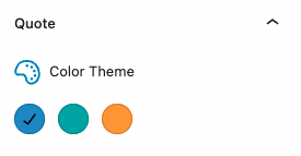
When developing your blocks and adding new options, you may need to add icons to improve the user experience. We have many icons already available for use. You can see the full list in our Storybook under Editor -> Icons section. We already added the icon when adding a new Color Theme option for the Quote block. Here is the simplified version:
import { ColorPaletteCustom, IconLabel, icons } from '@eightshift/frontend-libs/scripts';

return (
    <ColorPaletteCustom
        label={<IconLabel icon={icons.color} label={__('Color Theme', 'es-theme')} />}
        // ...
    />
);
This was the end result when we were adding a new option in our Quote block:

Conclusion
As you could see in this blog post, there are multiple ways of adding assets to a project. It all depends on how these will be used and what the scope of their use will be.