In this blog post, we'll give you a practical explanation about the difference between components and blocks. For a truly in-depth explanation about components and blocks, you can refer to our documentation. A more specific explanation about using components in a block can be found in the Component in a Block section.
One of the things that is really confusing to newcomers is the difference between components and blocks. Let's break it all down.
Component
A component is like a blank slate, a template without context.
It doesn't know or even care for what it will be used. Can you combine multiple simple components into one complex component? Absolutely! That's exactly what we'll do in the following example.
Let's say we have a component that consists of an image and a heading. Image and heading are two simple components that come with the theme out-of-the-box.
Here are a few examples of how this new component can be used:
- displaying a post
- displaying a user or an author
- displaying a photo with the photographer's name
- and many more...
As you can already see, there are many ways you can use this component. What helps expand the usability of this component even more are attributes. Let's say we have the following attributes:
imagePosition- left, right, top, bottomimageShape- rectangular, circularimageWidth- 25%, 50%, 75%headingColor- black, blue, redheadingSize- small, medium, large
These attributes give you the option to modify the look of the component, so this specific component can be used for the following:
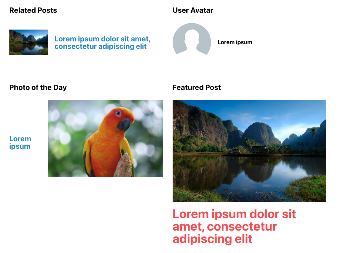
- related posts - rectangular image on the left side, 25% image width, heading takes up the remaining 75%, medium heading colored in blue
- user avatar - circular image on the left side, 25% image width, small heading colored in black
- photo of the day - rectangular image on the right side which takes 75% width and photographer's name is written in medium blue text
- featured posts - rectangular image on top, large heading in red color

You can even add conditional logic to your options, e.g. to have the option for imageWidth visible only when imagePosition is set to left or right. And when imagePosition is set to top or bottom, it defaults to 100% width.
Block
So, what about blocks? Blocks can consist of one or more components and, most importantly, allow you to use them in the editor. Technically, blocks can consist of zero components, but we encourage you to build blocks from components because that increases the reusability.
Blocks give context to the components.
Now that we have our component - let's call it card-simple - we can use it in a Featured Posts block. In component's manifest.json, we've already defined how we want it to look by setting some defaults. When using this component in our block, we can override some attributes in block's manifest.json. Since it will be used for displaying featured posts, we can define that imagePosition should be set to top.
After defining how we want our component to look while displaying featured posts, we need another attribute which will allow us to choose which posts to display in our block.
To do that, we'll add a new attribute called featuredPosts which will define which posts will be displayed in our block. For each selected post, another card-simple component is added, and featured image and post title are dynamically added to its image and heading components. More about the query logic and adding new options in a block will be covered in a future post.
You may be wondering, can you have a block that allows you to use all options of the card-simple component? Of course! You can create a block that allows you to set all available options in the editor and manually add content to the image and heading. There are also block variations, which allow you to set up predefined attributes for a block. More about setting up block variations may be covered in one of the future posts.
Conclusion
Hopefully, these examples helped you get a better understanding of the difference between components and blocks. It may take a bit more time or practical use to understand the difference and reasoning behind it. Our next post will walk you through downloading one of our components and blocks with WP CLI and modifying it.